AWESOME IMAGE HOVER
Let’s start creating this image slide effect step by step.
- Creating HTML for this
What should be the HTML for this? we need three <div>for images and all three divs are wrapped in a parent div.
<div class=”container”>
<div class=”img img-1"></div>
<div class=”img img-2"></div>
<div class=”img img-3"></div>
</div>
we create 3 empty <div> class of ‘img’ because all the styling are same except clip-path. we set the background image and clip-path for each div by specific classes ‘img-1,img-2,img-3'.
- Basic presetting for CSS: As we do all the time
body{
  background-color:#000;
  height:100vh;
  display:flex;
  justify-content:center;
  align-items:center;
  box-sizing:border-box;
}
Step 3): It’s time to add a container for images and add some styling.
}
.container {
  position: relative;
  width: 80rem;
  height: 50rem;
  background-color:#5C5C5C;
}
Here we take the relative position as we want to position our images absolutely with respect to our container.
Now add styling our wrapped 'div' in which images are inserted as a background’ through a common class which gives the same styling to all div by ‘img class’.
we want to cover our container, so the top and left should be zero, and width and height should be 100%.
.img {
  position: absolute;
  top: 0;
  left: 0;
  width: 100%;
  height: 100%;
   bckground-repeat:no-repeat;
  background-size:cover;
  background-position:top;
  transition :all .5s; /*for smoothing effect*/
}
And last, add images in the background with the specific class of each div.
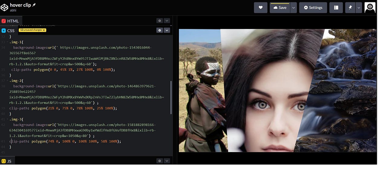
.img-1{
  background-image:url(' https://images.unsplash.com/photo-1543016044-365567f8e656?ixid=MnwxMjA3fDB8MHxzZWFyY2h8Nnx8Ym95JTIwaW4lMjBkZXNlcnR8ZW58MHx8MHx8&ixlib=rb-1.2.1&auto=format&fit=crop&w=500&q=60');
 clip-path: polygon(0 0, 45% 1%, 27% 100%, 0% 100%);
}
.img-2{
  background-image:url('https://images.unsplash.com/photo-1464863979621-258859e62245?ixid=MnwxMjA3fDB8MHxzZWFyY2h8MXx8YmVhdXRpZnVsJTIwZ2lybHN8ZW58MHx8MHx8&ixlib=rb-1.2.1&auto=format&fit=crop&w=500&q=60') ;
clip-path: polygon(21% 0, 75% 0, 78% 100%, 25% 100%);
}
.img-3{
  background-image:url('https://images.unsplash.com/photo-1581882898166-634d30416957?ixid=MnwxMjA3fDB8MHxwaG90by1wYWdlfHx8fGVufDB8fHx8&ixlib=rb-1.2.1&auto=format&fit=crop&w=1050&q=80') ;
clip-path: polygon(74% 0, 100% 0, 100% 100%, 58% 100%);
}
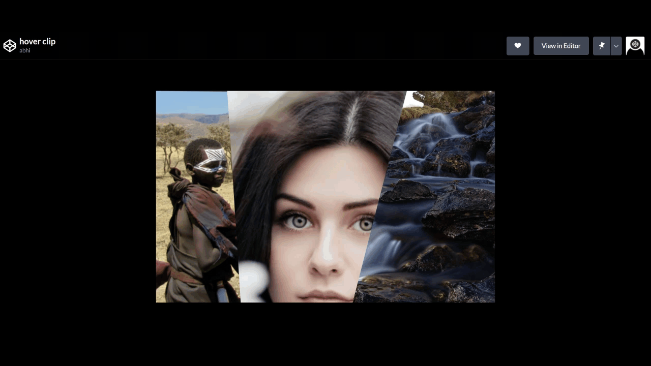
All the images are on top of each other which is why you can not see all the images.
Now clip the images or you can say clip the div class of ’img’ using clip-path .So that we can see all the images and it will look exactly as we want in our design.
.img-1{
clip-path: polygon(0 0, 45% 1%, 27% 100%, 0% 100%);
}
.img-2{
clip-path: polygon(21% 0, 75% 0, 78% 100%, 25% 100%);
}
.img-3{
clip-path: polygon(74% 0, 100% 0, 100% 100%, 58% 100%);
}
Only one part missing is hovering on image. What we want on hovering?
when we hover on one image we want to hide the other two, so that we can see full-width image. How can we achieve that? Let’s see….
First when we hover over the container , we have to shift all the images to the left or right corner so that we can not see Using clip-path means cut the whole part and same time using clip-path add in container and img:hover pseudo class give the full width and height. simply means no clipping.
.container:hover .img {
clip-path: polygon(100% 0, 100% 0, 100% 100%, 100% 100%);
}
.container .img:hover {
clip-path: polygon(0 0, 100% 0, 100% 100%, 0 100%);
}
How it looks, you can see here.
We have created another cool hover effect!!!!