RIPPLE EFFECT
Ripple effect animation on the button in CSS
Links and buttons should be animated when hover, active, or clicked. So let’s create a ripple effect step by step.
When you hover over it, It’s getting bigger, and then in the end it fades out after like half a second or something, you see?
So this is what we’re going to build. So it moves up a little bit and creates this shadow beneath it and so it looks like it’s moving up in direction to the user.
So let’s go build that. By coding up this button, you will learn techniques that are going to be useful in countless situations in the future.
So you’re going to learn what pseudo-classes
and pseudo-classes are and why they are important.
and how to build a creative hover animation effect
using the transition property.
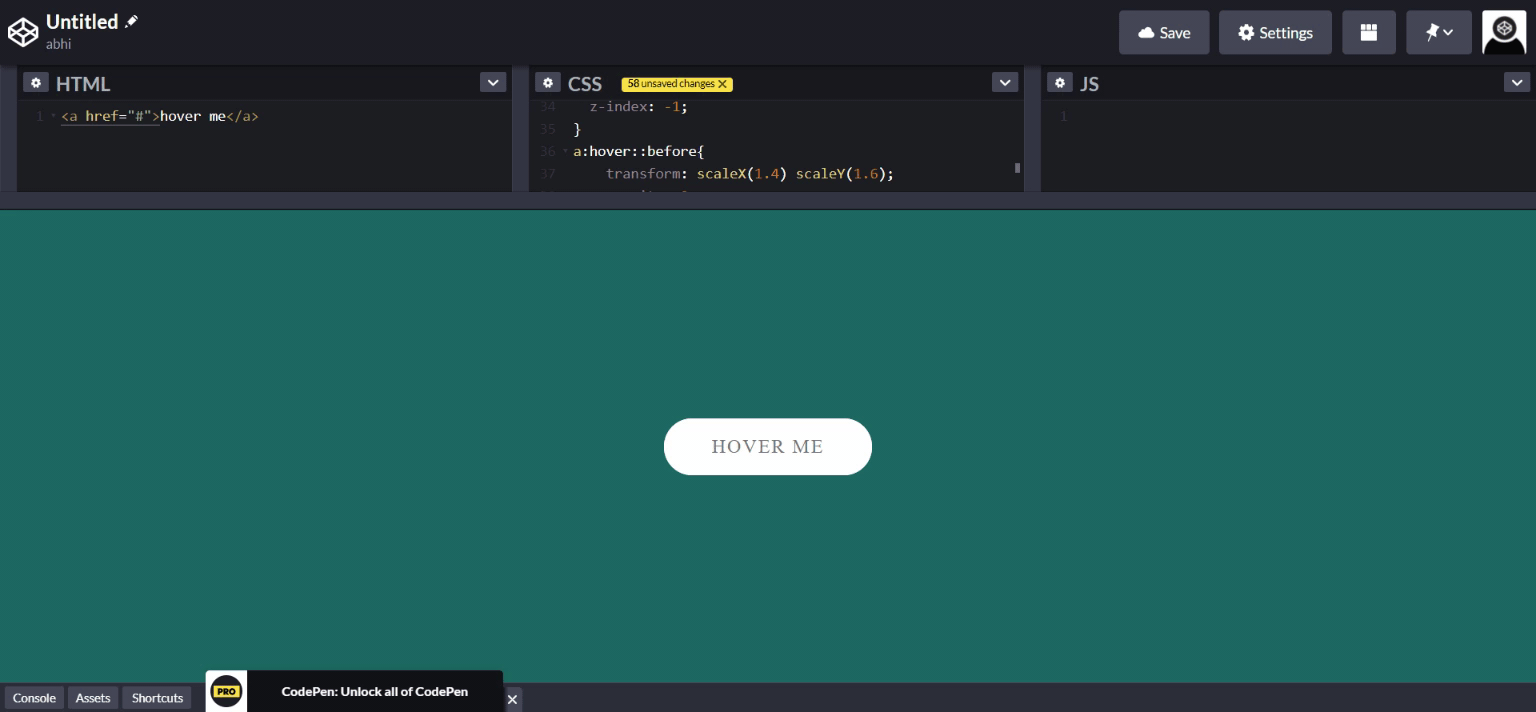
Step 1: Go to your HTML file and create a button In this example button is an anchor element, a link with anchor tag.
<a href="'>hover me</a>Step 2: We’re done with the HTML, but what’s missing is this cool animated button effect that I showed you right at the beginning. So come to your css file and start styling of your link or button.
a {
  position: relative;
  font-size: 1.2rem;
  text-transform: uppercase;
  text-decoration: none;
  color: #777;
  padding: 1.1rem 3rem;
  letter-spacing: 0.1rem;
  transition: all .2s;
  background-color: white;
  border-radius: 100px;
  font-weight: 400;
}
this is simple styling just added I’m sure you already know all of this, these properties that are not really new to you.
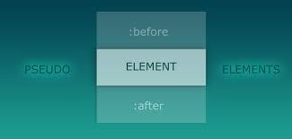
Pseudo-elements allow us to style certain parts of elements.
For example, the before pseudo-element that we’re gonna use adds like a virtual element before the element that we’re selecting and we can then style that element.
So the trick here is to add an element that looks exactly like the button that we already have, but we put it behind the button. And when we hover out of the button, then this hidden pseudo-element amazingly comes out behind the button. So let’s see how we can do this.
First, in order for a pseudo-element to actually appear on the page, we need to specify its content property. So that’s always necessary. It doesn’t matter what the content is. It can even be empty like we’re gonna do here, but we have to specify it. Otherwise, it’s not going to appear.
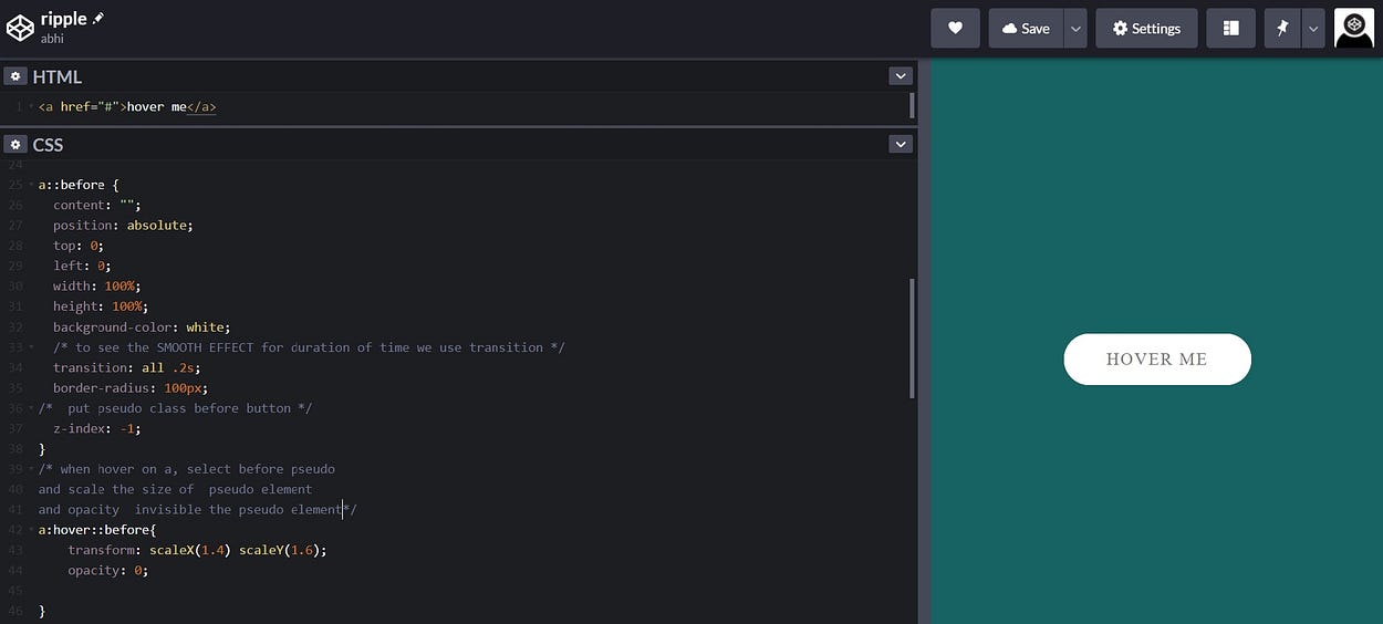
So we want to have a height of 100%. And we want to have a width of 100% as well. This works because the before pseudo-element is basically treated like a child of the button.
And so if we say that we want the height to be 100%, that’s 100% of the width of the button.
For example, suppose that the button has 100 pixels of height and 50 pixels of width. So this 'before' pseudo-element will have the exact same dimensions if we set it to 100%. We use position absolute to put exactly on button place and Z-index put it behind our button.
Now since it’s hidden, I cannot really show it to you on the page now.
So when do we actually want to see it? We want to see it when we hover the button.
the pseudo-element that becomes visible as soon as we hover over the button.
And we also want this to be animated.So we have to put the transition property. We do it in the initial state. In this case, the initial state is of course this 'before pseudo-element'.
On hover transform the button upward and add box-shadow.
And when it clicks, in :active pseudo class , we transform it down.
a:hover::before{
    transform: scaleX(1.4) scaleY(1.6);
    opacity: 0;

}
a:hover{
    transform: translateY(-.2rem);
    font-size: 1.2rem;
    box-shadow: 0 1rem 2rem rgba(0,0,0,.2);
}


a:active{
    transform: translateY(.2rem);
    box-shadow: 0 .5rem 1rem rgba(0,0,0,.2);
}
See the code you will understand better.
So you have created this beautiful ripple effect. that’s great!